Visual identity
media: brand book & style guide | role: art director & designer
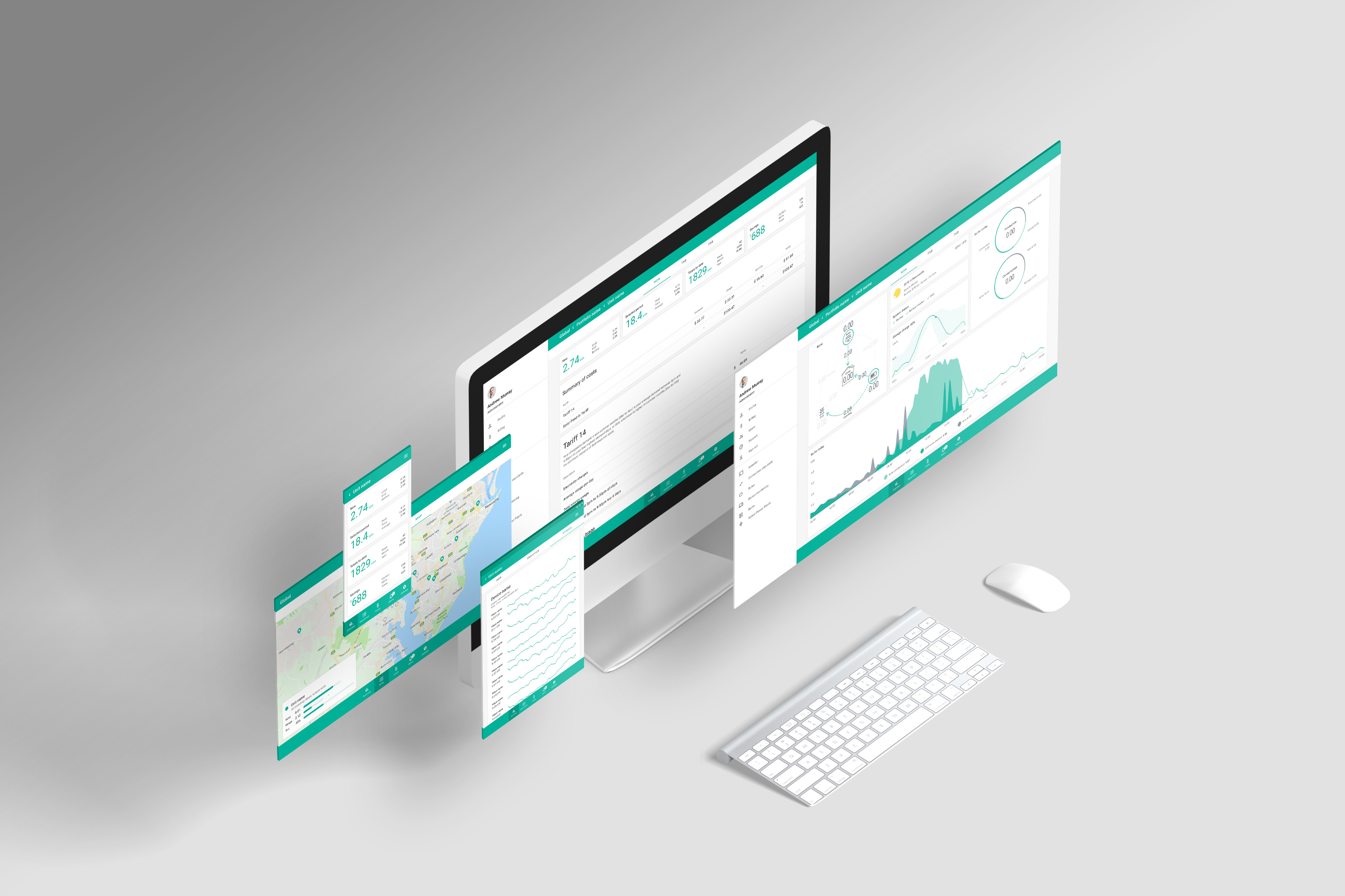
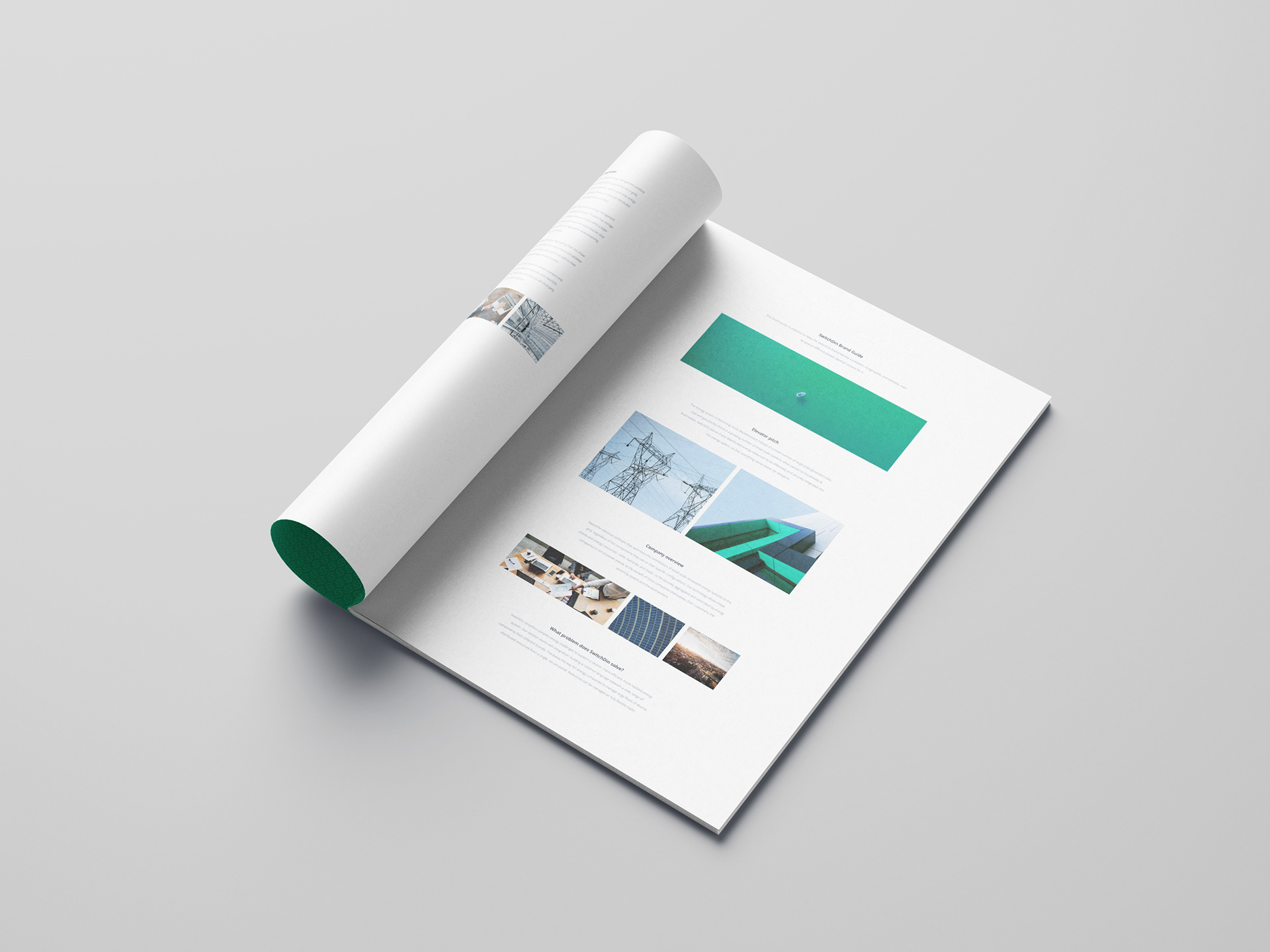
SwitchDin is a startup in Newcastle that develops hardware and software to manage solar, batteries and energy loads for home and commercial markets. Over the last couple of years, they have experienced tremendous growth from a backyard operation to a highly regarded innovation hub. As SwitchDin grew, it needed a visual identity refresh to reflect its new position as a significant player in the renewable energy sector.
Their existing visual identity consisted of a logo, and their communications were ad hoc and unsophisticated. I worked with the in-house team to define the business's values, goals, strategy and personality.
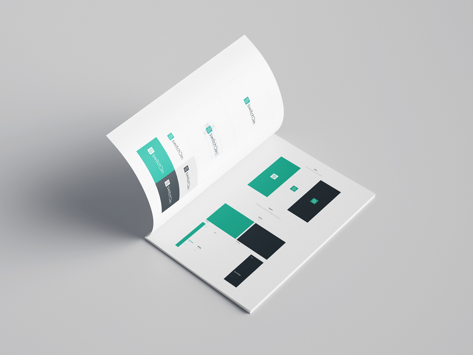
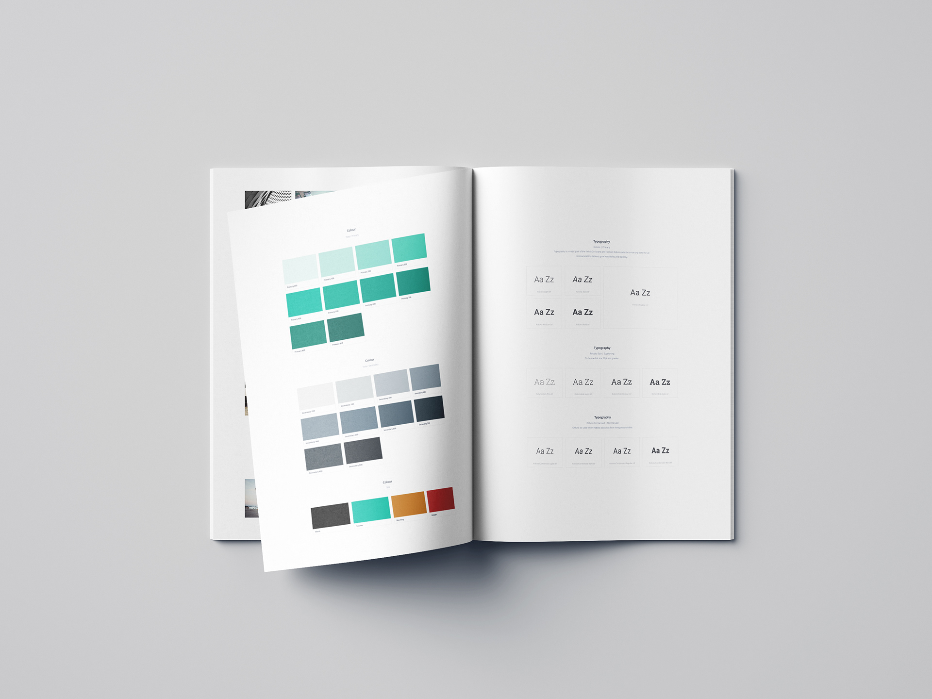
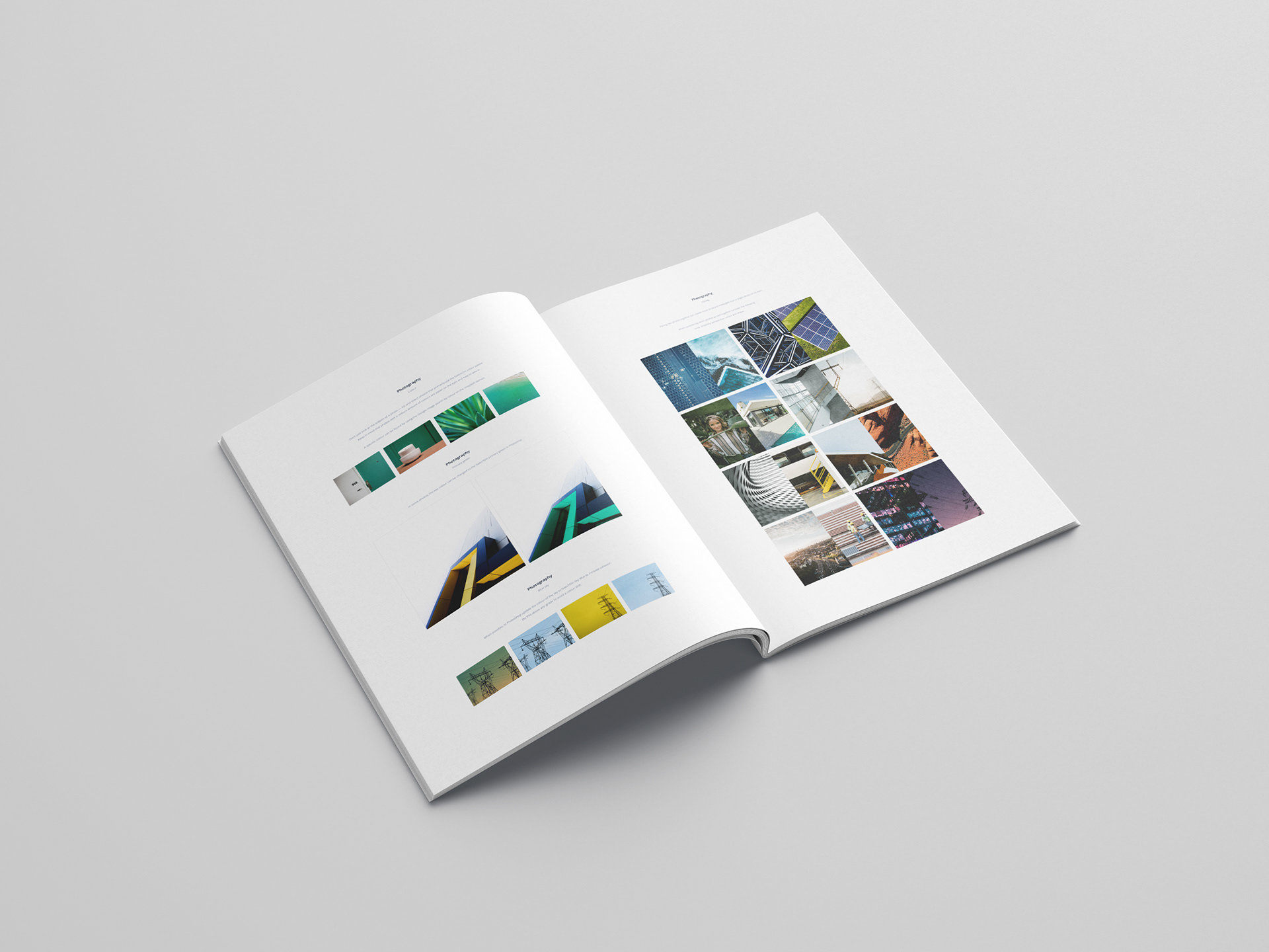
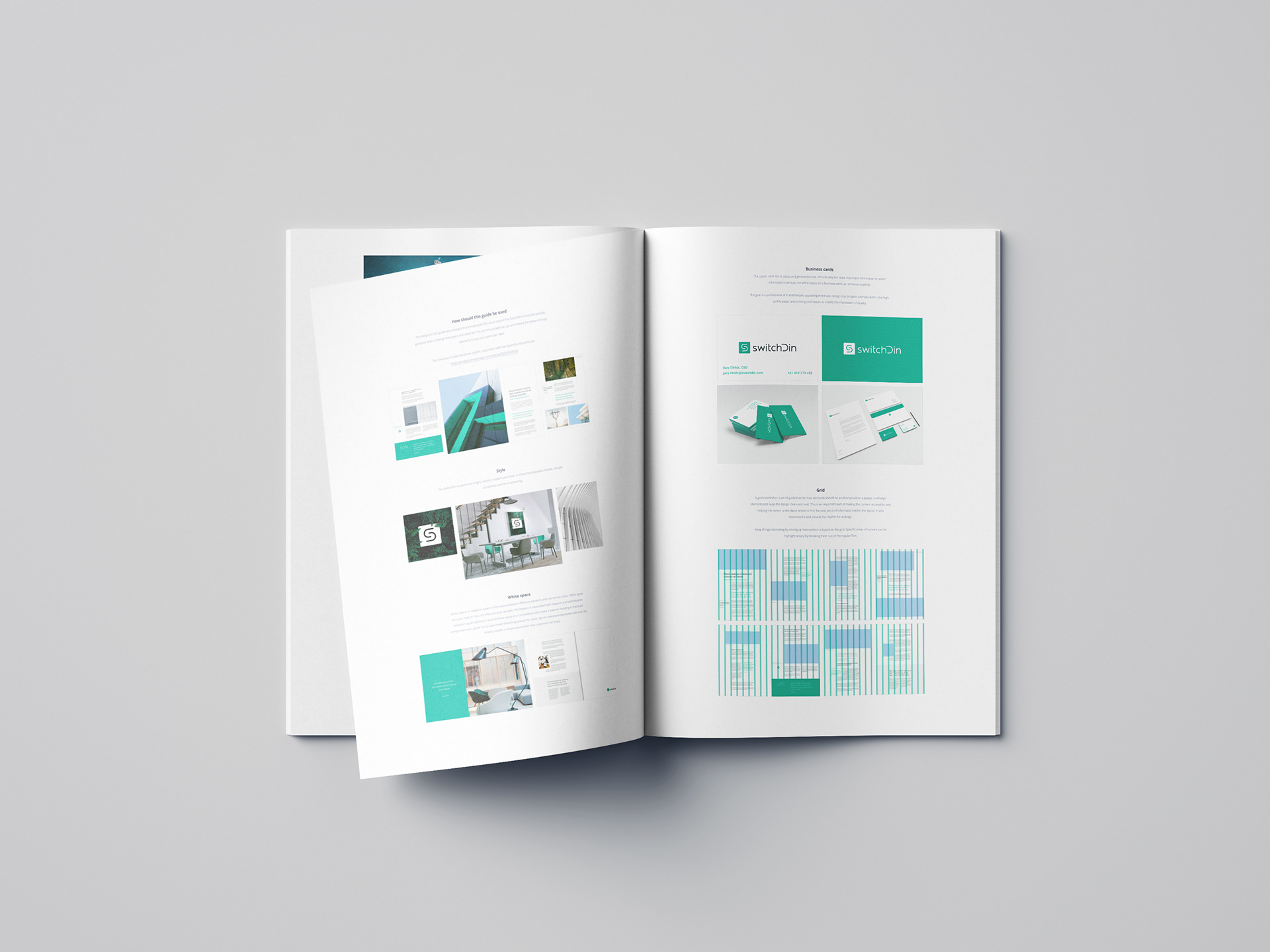
The visual identity refresh included; tweaking their logo design to increase clarity at small sizes, introducing a colour pallet and colour system, updating their typography and creating guidelines for their illustrations, icons and photography. Easy-to-follow templates were created for the most common communication channels to give staff clear design direction and inspiration.
The outcome was a sophisticated brand identity with consistent collateral across all communication channels and a recognisable personality in a competitive and rapidly evolving market.
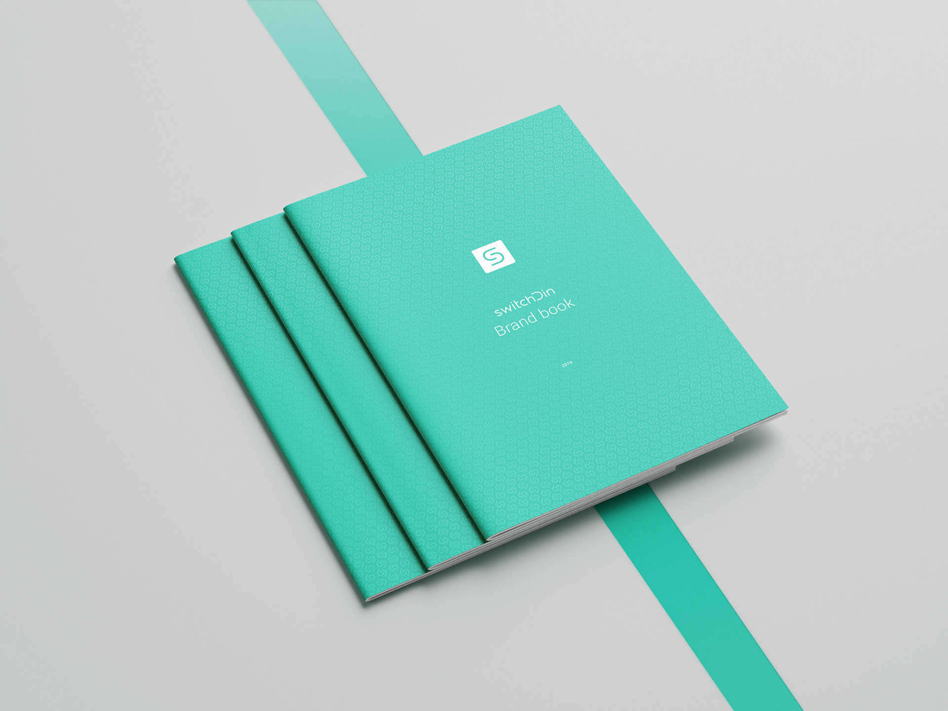
Brand book
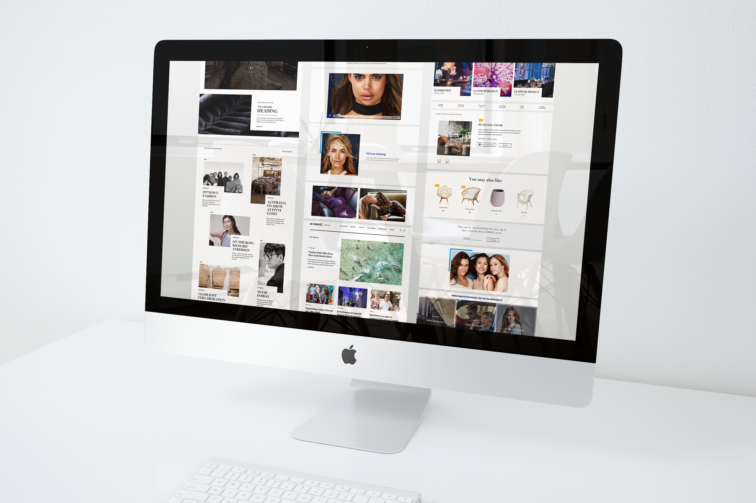
Marketing website components